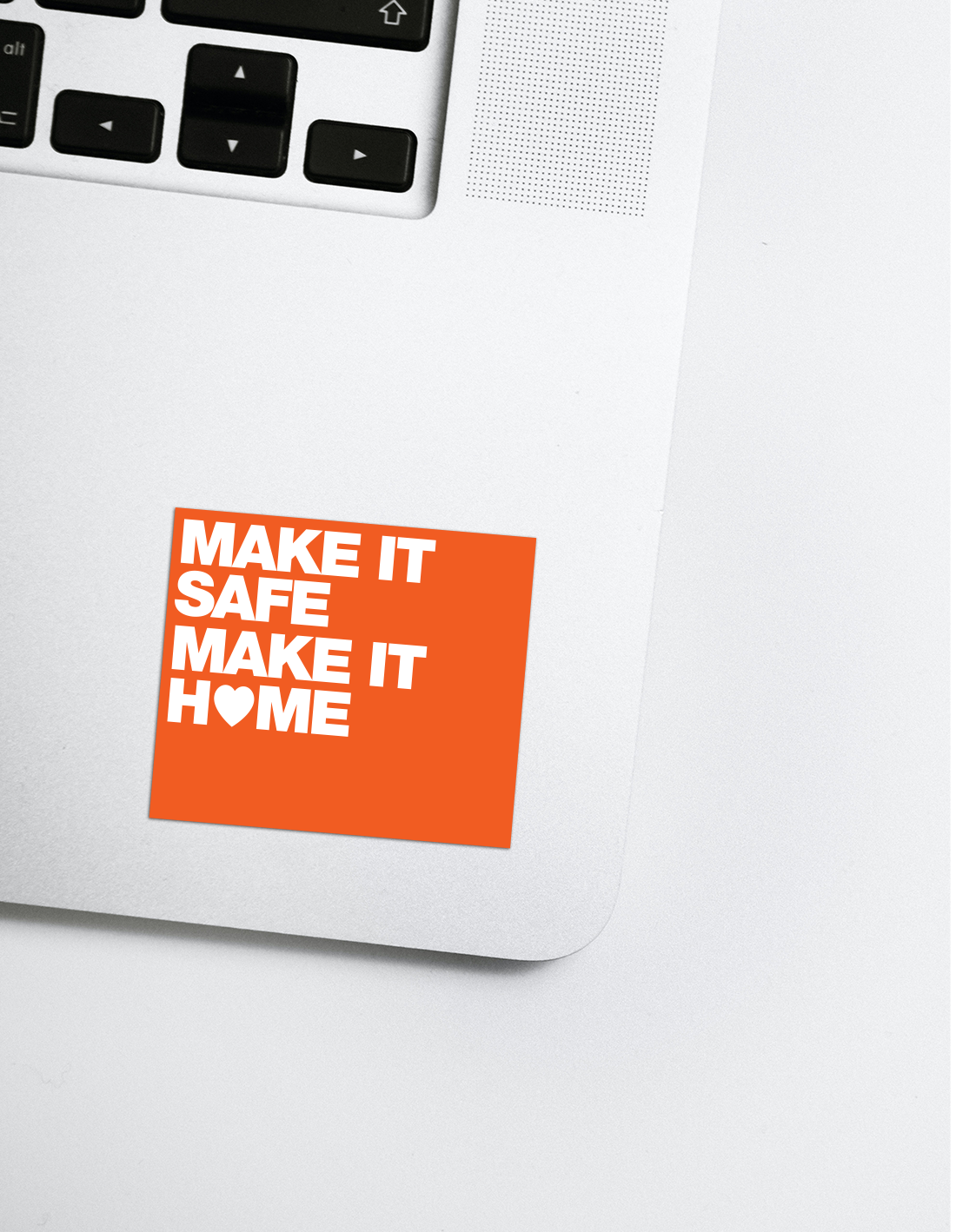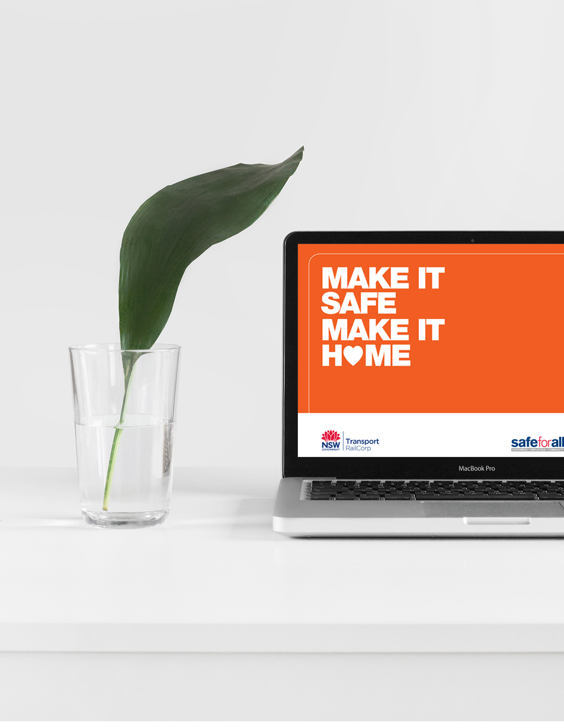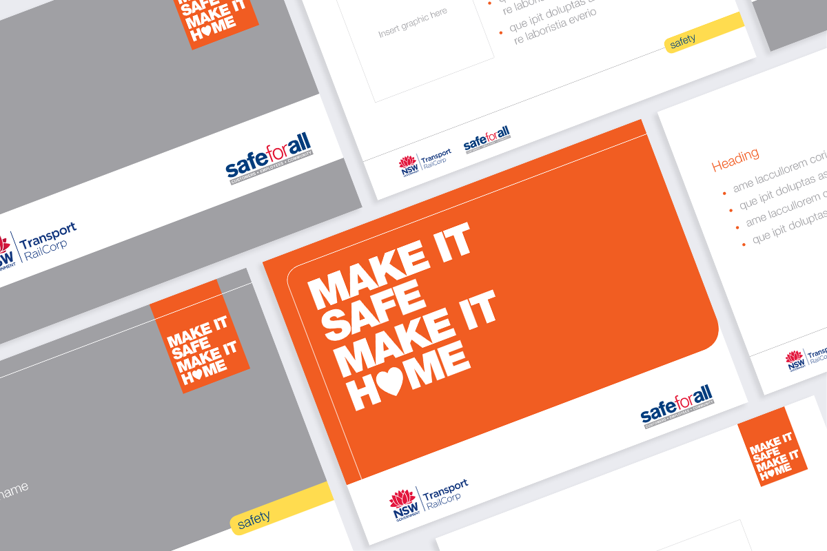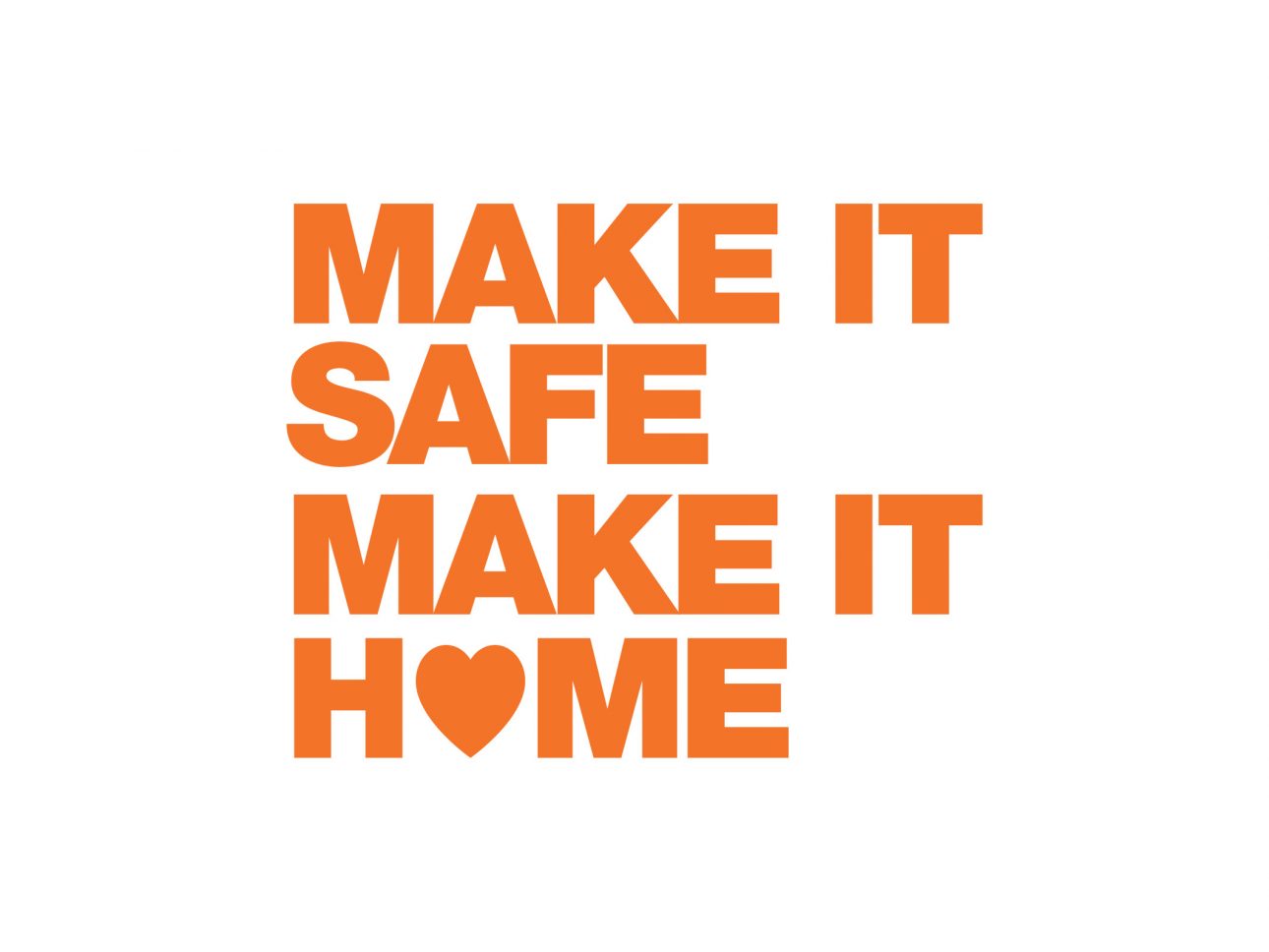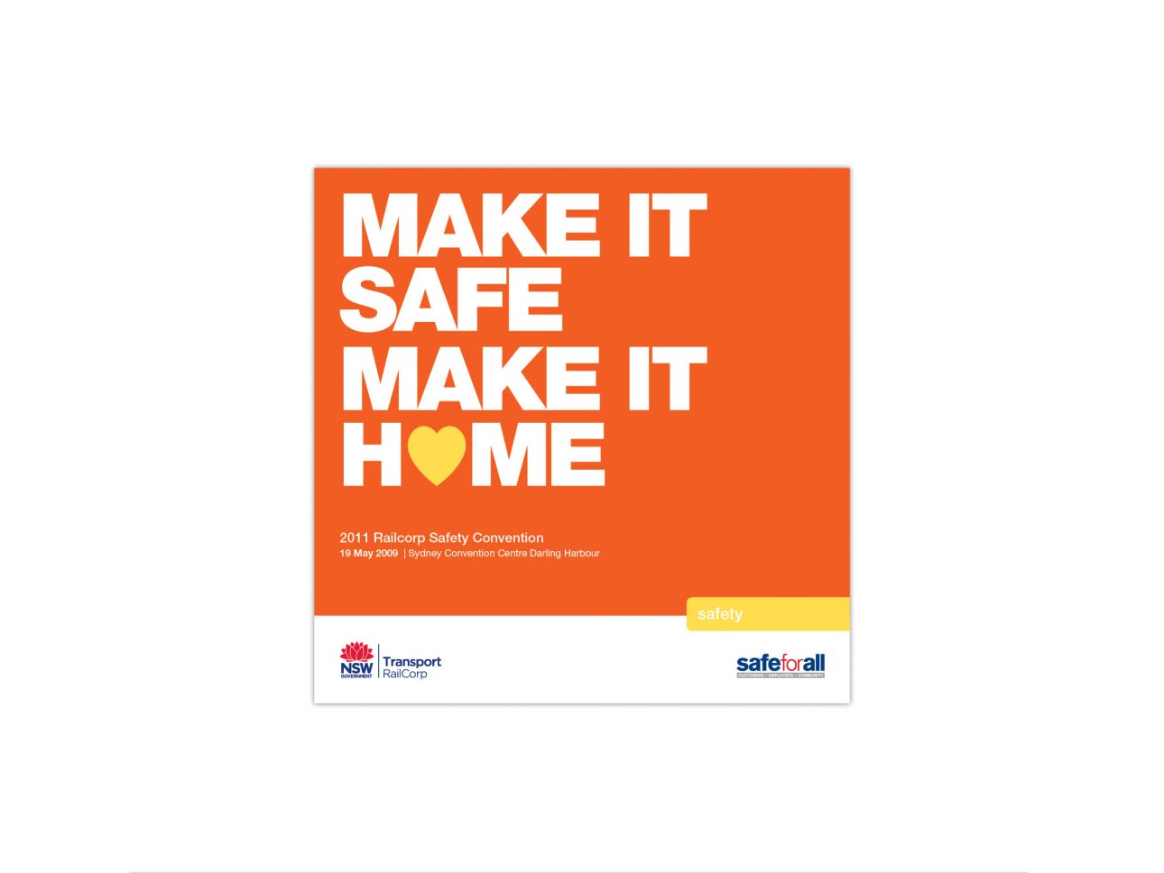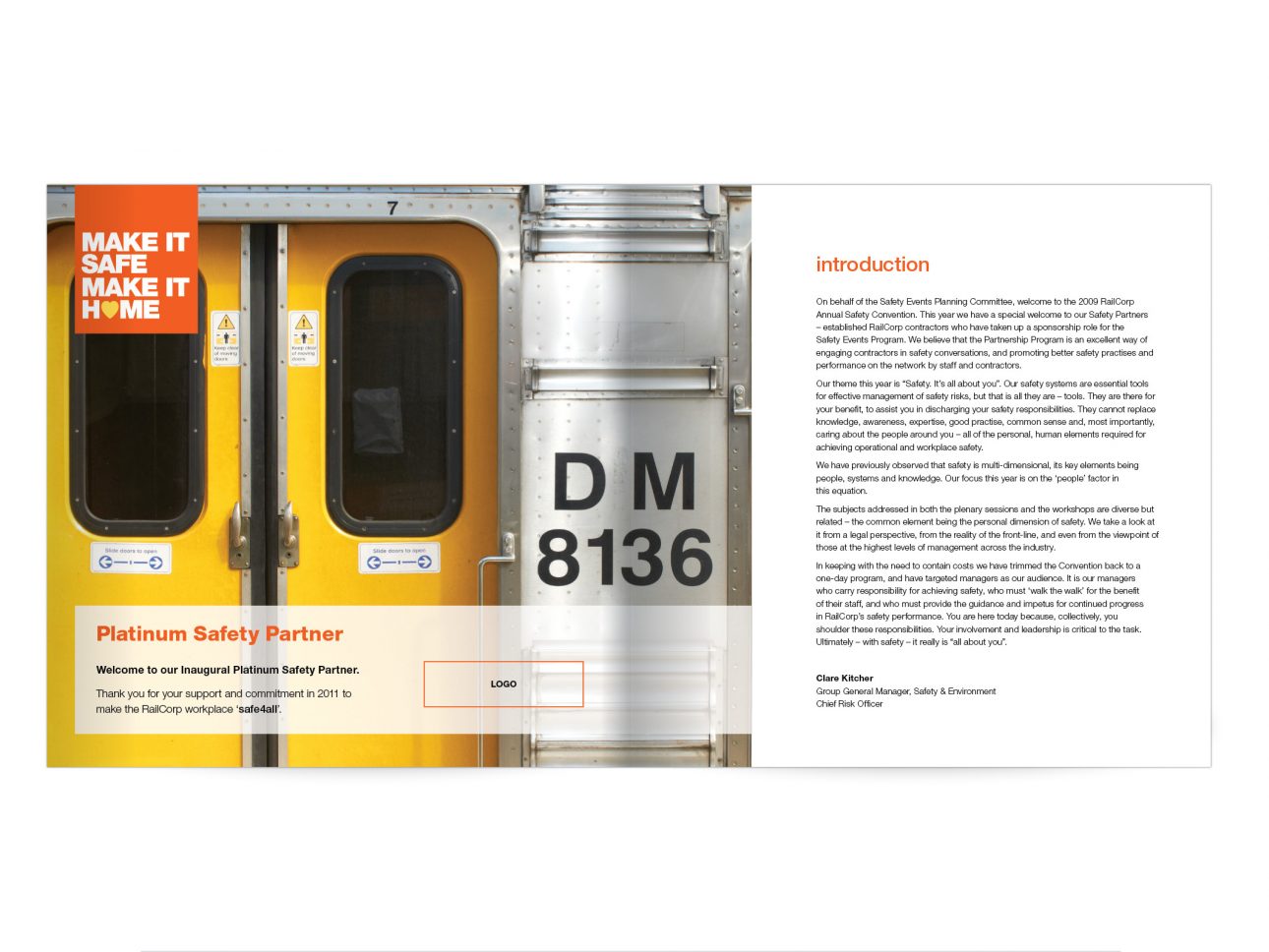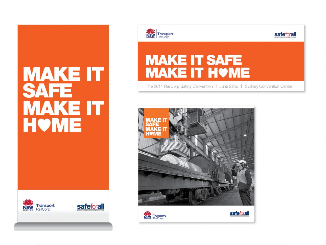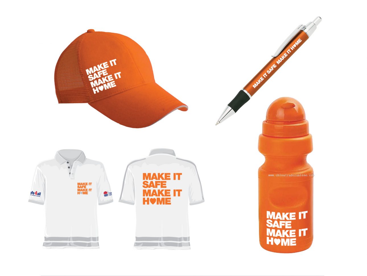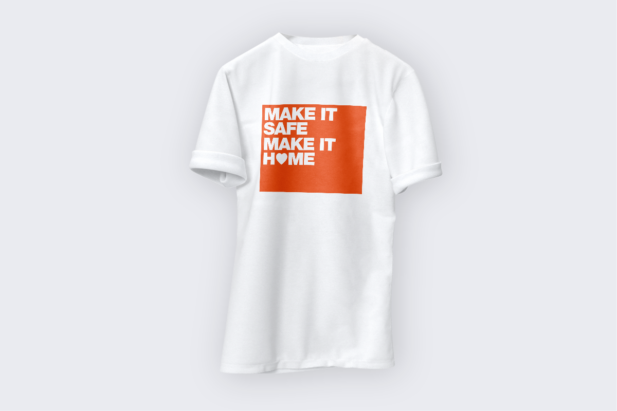

The Railcorp Safety Convention is hosted annually to reinforce the importance of safety on and around railways and targets all levels of employment and their families. The following design concept grew from the idea that ‘home is where the heart is’. The inclusion of the heart icon within the word ‘HOME’ exudes warmth and emphasises the care RailCorp has for its staff.
The bright orange colour was representative of the safety vests the rail workers wear. It was intended to be easily seen in the busy convention centre and reinforced the strong message of safety first. This visually aesthetic campaign had a very strong presence overall and it’s clear safety message demanded attention.
I designed this campaign from concept to production with guidance from the creative director and client.
