
Work Networks are all about connecting people inside organisations.
The team had outgrown their branding and required something that better aligned with their ethos and their customers. They wanted colour and to take a bolder approach than their stuffy corporate competitors.
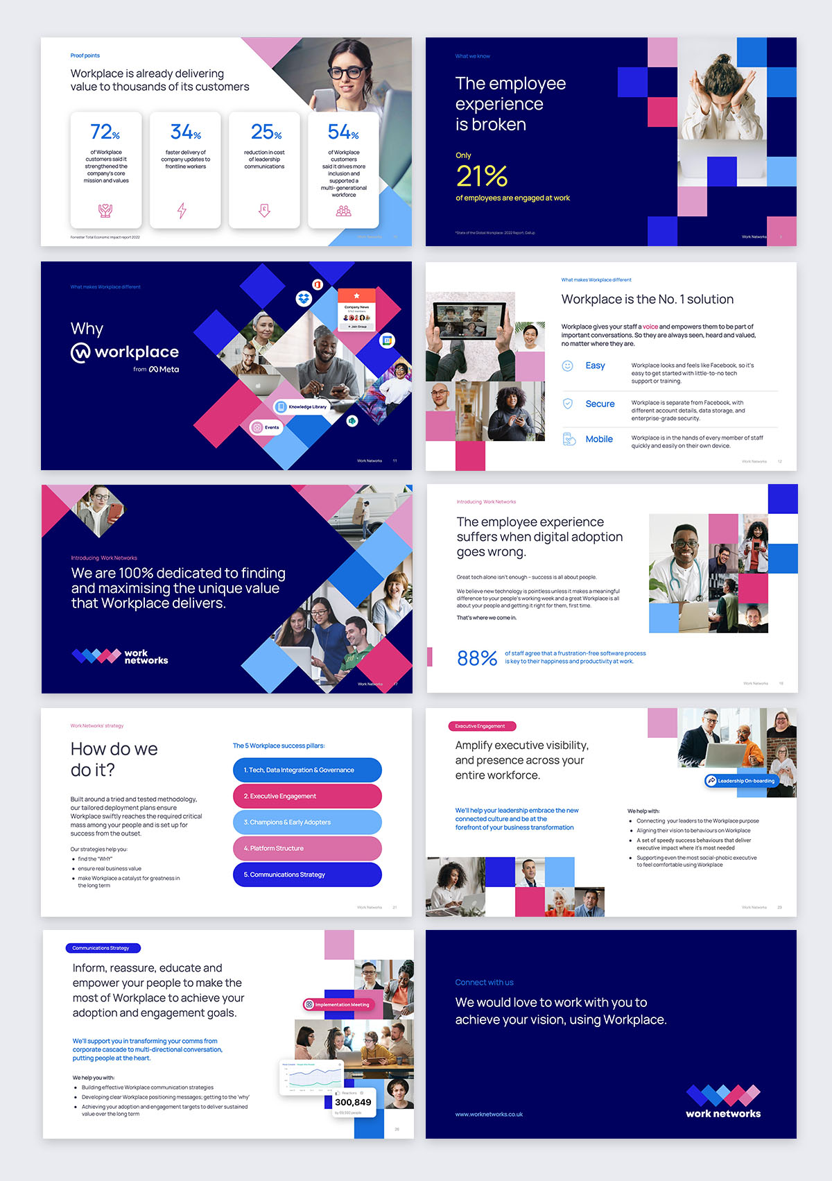
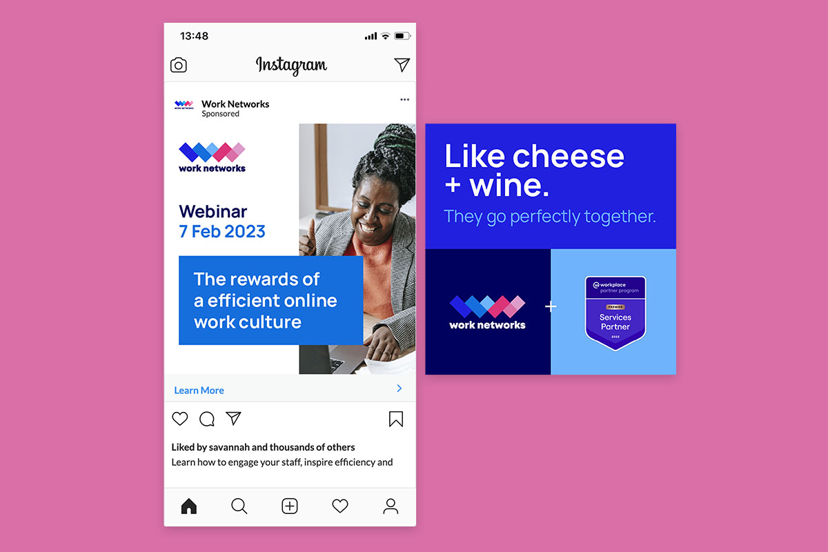
We created a new logo and colour palette to brighten the persona. The bold colours are guaranteed to stand out amongst the overly saturated bland linkedin feed. A grid like graphic structure was created to allow for flexibility and variation with its use. With people at the centre of their mission, lots of images of diverse groups of people, from a wide range of industries, we are able to find a way to be relatable to the intended audience.
Elements of technology were added throughout to help drive back the connection with the platform and how it links everything together.
At the heart of this project was the sales presentation, which followed by helping the internal team create all the visual assets for their wix website. I worked directly with their team to make sure the website branding matched their sales deck, when they started to go to market with it.


